Cole Nussbaumer Knaflic
2018-04-27
2018-04-27
Jon Peltier is a legend when it comes to charts in Excel – check out his post on Gannt charts in Excel.
Gannt charts are a project management tool that help you visualise and understand the relationships between tasks and how the project time line is progressing.
You may have noticed that Excel gives every chart a unique number when it creates the chart. It is displayed in the Name Box in the left corner above the grid. You have the ability to change that name and make it more descriptive.
We’ve all been there, our charts are looking just right and then some one inserts a column or changes the column width and throws out all our perfectly proportioned charts.
Charts have a behaviour that many people don’t realise. That behaviour can also be turned off. If you hide a row or column in the data range used by a chart, the values will also be hidden on the chart.
A nice example of how a chart changes as you develop the story and message behind it.
Note the additional change at the bottom of the post.
If you are ever tempted to start a column (bar) chart at a point other than zero, please read this post.
It also has suggestions for alternative chart types to handle comparisons.
Make your headings bold.
This tip applies to tables and to the structures you use for charts.
Excel looks for the bold format when it reviews tables and layouts to figure out if your table has a headings row.
You can use Ctrl + Shift + L to add or remove the filter icons to a data table. There is also an icon on Data ribbon tab.
This will work more reliably if the headings are bold.
I use the following keyboard combination on the top left corner of the table.
Ctrl + Shift + right arrow (this selects all the headings)
Ctrl + b (this applies bold to the headings)
Ctrl + Shift + L (to turn on filters)
This combination can be done very quickly.
You can just use Ctrl + Shift + L within the table, but sometimes this applies the filter to the wrong row.
I wonder if we can get one of these on Power BI?
Saw this on the website below and liked it – I also like Avocados.
Avocado article on the ABC site

When using charts/graphs in your presentations make sure you communicate the point of the chart/graph. Don’t assume the reader will get the point.
http://www.storytellingwithdata.com/blog/2017/3/22/so-what
The above blog post explains and demonstrates the issue well.
Some informative charts showing how the world has change in the last 200 years.
Worth a look – some good trends there.
When you paste Excel charts into Word or PowerPoint you may also be pasting all the underlying data that created the chart.
To get around that problem, you can use the Copy as Picture option.
This option is on a drop down on the Copy button on the Home ribbon – see image below.
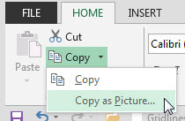
You have a few options to choose from on what and how to copy.
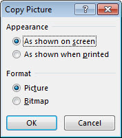
This treats the chart as a graphic, which breaks any links to the underlying data. It also makes it much easier to re-size the chart when you paste it in the destination document.
It is not dynamic at all – it is a point in time capture.
Just because you can, doesn’t mean you should. This applies to many thing in Excel and especially to charts. With charts the “less is more” philosophy works well. Have a look at the four charts in the image below.
OK I have bitten the bullet and decided to get stuck in to Power BI. I am going to start playing around with Power BI Desktop – it is free after all. I thought I would blog about the experience and share my journey. I have created a Power BI category. I now have a button on my website that will list Power BI posts.
I learned about a chart Axis option in Excel during a recent webinar – thanks to one of the attendees. You can show the Axis entries below the chart – this is handy for column charts that display negatives.
I was reading a magazine last week and a chart caught my eye. I thought I could improve it. I recreated it in Excel – its close to the original – see below – I didn’t quite match the column colour.
This is a great video on data visualisation in general.
It includes two great tips, with examples, to improve your visualisations.
Cole has a great website as well.
It is common in accounting to compare numbers. Either Actuals vs Budget or this year vs last year. There are different charts that people use for this comparison. How about plotting the variance instead?
This site allows discussion on Data Visualisation topics.
You can post examples of good and bad visualisations for comment.
Some good insights from Seth Godin about how to display a message and get your important point(s) across.
Check out my follow up article and VIDEO on the ITBDigital website on how to convert a vertical bullet chart into a horizontal one.
Click here for full article and video.
For the original bullet chart post click here
These techniques are based on ones in the great book
Excel 2007 Dashboards and Reports For Dummies by Michael Alexander
An Excel MVP and a chart guru. His site has GREAT chart resources.
Check out my July 2014 article on Bullet charts on the CPA Australia ITBDigital website – click here to see the article. The video is below.
Bullet charts were developed by Stephen Few – see his pdf on bullet charts click here.
The technique is based on one used by Michael Alexander in his great book Excel 2007 Dashboards and Reports for Dummies by Wiley.
I nice article on alternatives to pie charts. I prefer the 100% stacked bar chart.
The term grouping in Excel has many different meanings, probably more than any other term in Excel.
When building dashboards in Excel you frequently need to have multiple charts that are exactly the same size. Luckily Excel makes this reasonably easy to achieve.
This post is attempting to replicate a slope chart.
I took a standard Line chart as seen in the top of this image. And then used the Design Tab option Switch Row/Column to create the slope chart at the bottom of the image.
If you need to move or amend a lot of graphics at once Excel has a feature that can save you time and effort. It’s been around for a while, but it’s been hidden away in the latest few versions.
Line charts are frequently used in Excel but their default settings leave a lot to be desired. See the transformation of a standard line chart to a simpler and easier to read line chart.
Don’t forget, many people (mainly men) have issues seeing all the colours.