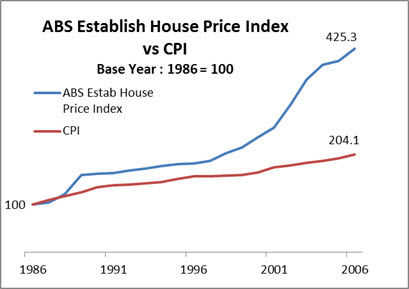
Line charts are frequently used in Excel but their default settings leave a lot to be desired. See the transformation of a standard line chart to a simpler and easier to read line chart.
Here’s the standard / default Excel line chart.

I have recorded a video of the steps taken to convert the standard line chart to the improved line chart chart at the bottom of this post. (I have included the file I used in the video at the bottom of the post)
I have listed the steps below
- Delete the gridlines
- Delete the vertical axis and title
- Increase size of the plot area
- Move the legend
- Change the date axis and show every 5 years only
- Add data labels to the end of the lines
- Add the starting data label to one of the lines
 Below is a link to the file I used in the demonstration.
Please note: I reserve the right to delete comments that are offensive or off-topic.