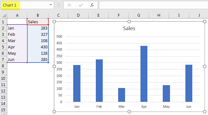
You may have noticed that Excel gives every chart a unique number when it creates the chart. It is displayed in the Name Box in the left corner above the grid. You have the ability to change that name and make it more descriptive.
Excel provides a unique number for each chart it creates, see image below.
There are a couple of ways that you can change that name.
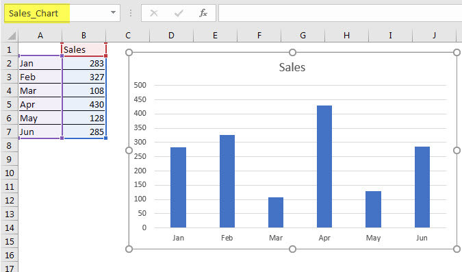
The first is by clicking in the Name Box when the chart is selected and simply typing in a new name. You can have spaces in the name, though I tend to use the underscore character instead – see image below.
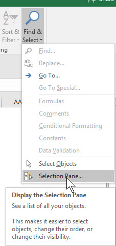
Once you have named your charts with descriptive names then you can use the Selection Pane to see the charts listed.
To display the Selection Pane go to the Home ribbon and on the far right click on the Find & Select icon and choose Selection Pane from the bottom of the list.
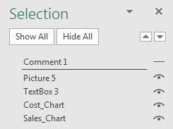
The Selection Pane will display on the far right of the screen and it will list all of the charts. See image below.
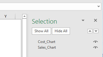
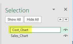
You can rename the chart by double-clicking on the chart name in the selection panel – see image below.
The icon on the right of the name allows you to hide and unhide the chart/object.
The Selection Pane also lists all of the other objects on the sheet. It will include any cell comments as well as text boxes or images – see image below.
This can be a quick way to see how many cell comments or other objects are on a sheet.
Please note: I reserve the right to delete comments that are offensive or off-topic.