I was reading a magazine last week and a chart caught my eye. I thought I could improve it. I recreated it in Excel – its close to the original – see below – I didn’t quite match the column colour.
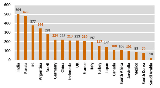 I have left out the title and source and I will just focus on the chart design itself.
The four points to improve are:
- remove the grey background colour, including the gridlines
- change the chart type to a bar chart, which makes the country names easy to read
- remove the value axis – all values are displayed, its not required
- change how the values are displayed
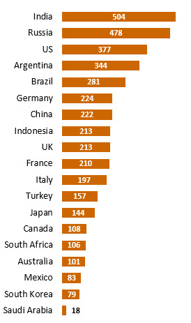
The amended chart is shown below. It is about the same size, but more readable and “cleaner”.
In general, keep charts as simple as possible. The quotes below are both old, but apply perfectly to charts today.
It only took a couple of minutes to amend the chart. The trickiest part was the last item, Saudi Arabia. The bar is so small that the value label won’t display. It is hard to even select the label. I cheated and changed the value to 180 which made it easy to select the label and change the setting so that the label displayed outside the bar. I then changed the value back to 18.
Let me know in the comments below if you agree with my improvements.
Click the button below to download the example file.
Download Example File
Please note: I reserve the right to delete comments that are offensive or off-topic.