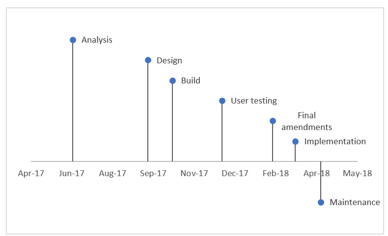
Timeline charts are an effective way to display events over time. You can use a new Excel 2016 feature to easily create a timeline chart.
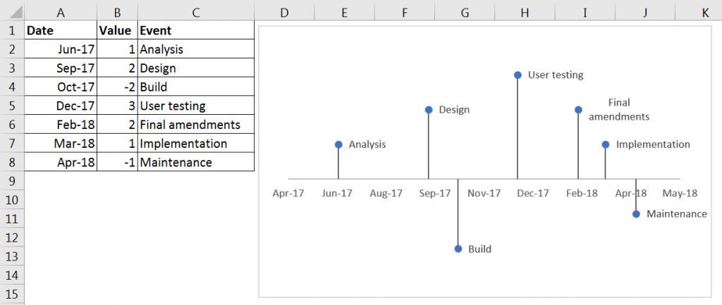
We will create a timeline based on the table below. The Values in column B don’t represent anything, they determine the location of the Event text on the chart.
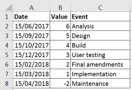
I have used the 15th of the month to centre the date in the month on the chart. You can download the example file at the bottom of this post.
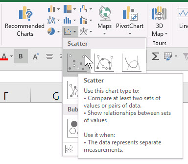
- Select the range A1:B8 and click the Insert ribbon and chose the first Scatter chart as per image below.

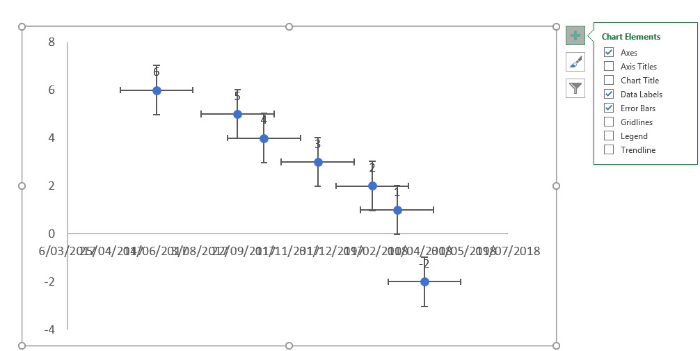
- Delete the Gridlines and the Chart Title. Add Error Bars and Data Labels

- Delete the left Axis.
- Delete the horizontal Error Bars (click one of them and press Delete on keyboard)

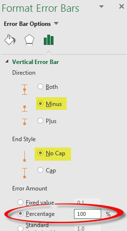
- Click a vertical Error Bar and press Ctrl + 1. In the Task Pane on the right select Minus, No Cap and select Percent and change it to 100% – see below.

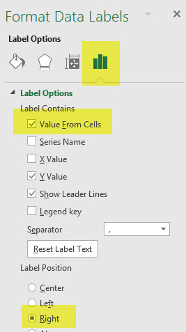
- Click a Data label and on the Task Pane on the right. In the Label Position choose Right. Then click the Value From Cells option. This is a new feature in Excel 2016.

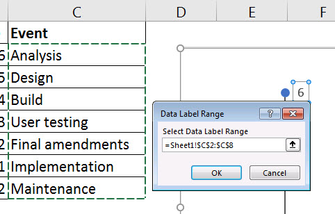
- A range selection dialog will open – select the range C2:C8 and click OK.

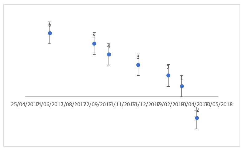
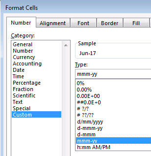
- Lastly change the format of A2:A8 to mmm-yy – see Format Cells dialog below.

- Chart complete

- You can move the text vertically by changing the values – see below.
Related Posts
Please note: I reserve the right to delete comments that are offensive or off-topic.