You can use a pie chart to display a percentage, but it wastes a lot of space. An alternative that takes up less space is an area chart.
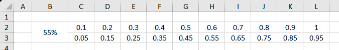
Below are some images from the Australian Bureau of Meteorology website. They display a percentage likelihood of rain including a small chart, for two separate days.
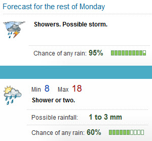
http://www.bom.gov.au/wa/forecasts/perth.shtml
This is not a standard Excel chart type and is hard to create as a chart. It is straightforward to create with Conditional Formatting.
If you want a horizontal or vertical progress chart I have written about them previously at the link below.
https://a4accounting.com.au/horizontal-or-vertical-progress-bar-in-excel/
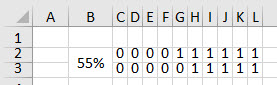
Let’s look at the layout we need to create a chart like this above.
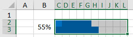
We need to create a matrix of 20 cells, 10 columns across two rows.
Each square represents 5% or 1/20th of the whole.
Note: this chart cannot display values over 100%.
We enter a value to display in cell B2. This is a merged cell. I rarely use these but because I need the effect of going across two rows I have to use it.
Cells C2 and C3 have their values input. Cell D2 and D3 have a formula that adds o.1 to the value from column C on the same row. That formula is copied all the way across to column L.
We don’t need to see the values, but we need them there for the conditional format to work.
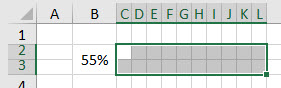
We now need to modify the range to have square cells. I will make the cells 15 pixels wide and high.
We can use a custom number format to hide the values. Select the range C2:L3 and press Ctrl + 1 this opens the Format Cells dialog.
In the Number tab select the last option on the right – Custom.
In the Type box enter ;;; that’s three semi-colons in a row and then click OK.

This format stops the values in the range from displaying or printing.
We now need to apply the conditional format to the C2:L3 range.
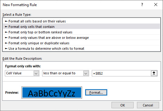
Click the Conditional Format icon drop down on the Home ribbon and select New Rule.
In the dialog that opens select the second option in the top section and select “less than or equal to” in the second drop in the middle section.
Click in the box on the end and then click cell B2 on the sheet. Use the Format button and click the Fill tab and choose a colour – I chose blue and click OK. It should look the image below. Click OK to apply the format.
The chart displays.
We need to add gridlines to the chart area. I will use blue lines to match the colour of the chart.
With the range still selected. Press Ctrl + 1 and click the Border tab.
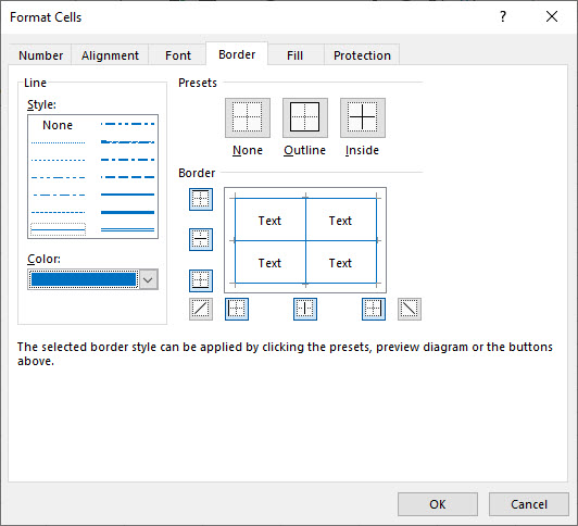
I have used the Inside and Outside Presets and changed the Color option to blue.
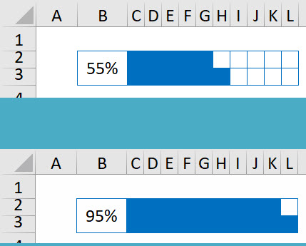
Job done – I removed the sheet gridlines and also added a border to the merged cell B2. A couple of examples below.
This can be useful for dashboards where space is at a premium. The downside is having to change the column widths and cell heights. To get around that issue consider using Paste Picture Link – see the link below.
https://a4accounting.com.au/flexible-dashboard-technique-for-reports/
Please note: I reserve the right to delete comments that are offensive or off-topic.