Gauge charts are not a standard chart in Excel and are quite complex to create. Gauge charts should be avoided for dashboards.
Gauge charts basically tell you a single score and how that score compares to what you are expecting.
On a car dashboard using gauges make sense because you have a lot of space and not many measures to display.
In Excel dashboards you typically display many measures and space is at a premium. Gauges are an inefficient way to show a number and whether it is within acceptable parameters.
It is much easier to use conditional formatting to handle this type of reporting.
Examine the sheet below.
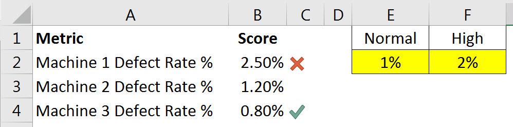
In a small area in the left corner we have displayed the defect rates of three machines. The entries in column E and F would not be part of the dashboard. They contain the parameters that will determine what is good and bad.
Just showing the percentage (column B) wouldn’t be helpful because it requires outside knowledge to know whether a percentage value is acceptable. Adding the icons makes it obvious whether a percentage is within acceptable parameters.
This is much more effective and efficient way to display values than three gauge charts.
When using conditional format icons I tend to use cell formulas to get the right results. The interface and the controls for icons are not that flexible. It is much easier to use cell formulas to return values that are then easier to convert into specific icons.
How many icons?
In our case we want to display either a cross (bad) or a tick (excellent). In general it is a good idea to reduce the number of icons you use so that you can emphasise values that are worth attention.
If you use more than two then you run the risk of having too many icons and slowing down the time it takes to read the dashboard. Depending on your requirements you may only use one icon to identify measures that need to be rectified or examined in more depth.
In our case we want to show a cross for the defect rate that is higher than the high value 2% (cell F2). And a tick for percentages that are below the normal parameter 1%.(cell E2). If the defect percent is between 1% and 2% then it is within normal expectations and it is not worth displaying icon – no action is required.
In general it is best to only use icons for exceptional values.
Be careful with colour
Avoid using colour alone (eg red, green and amber) as there are quite a few men who are colour blind and will not be able to identify the different colours. In our example we have used colour and commonly understood symbols.
The formula in cell C2 is
=IF(B2>$F$2,-1,IF(B2>=$E$2,0,1))
This has been copied down and it converts the percentages in column B into either
- -1 for a bad result
- 0 for a result we want to ignore and
- 1 for a result that is excellent
It is much easier to create cell-based formulas than using formulas within the conditional formatting interface.
With these results we can easily set up the conditions for the icons to display using a conditional format.
The conditional format using icons for the cells in column C is shown below.
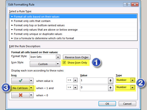
There are three things to note about the above dialog options.
- You can display just the icon – this hides the underlying value. I have used a separate column to calculate results that simplify the icon selection and to display the icon. That way I can reduce the width of the icon column so that it doesn’t take up much space. I can also leave column B to show just the score.
- The Type drop downs allow you to select different ways to apply a condition. The easiest one to use is the Number option.
- You can choose the icons to display and you can choose not to display an icon, as I have selected for the middle condition. The drop down displays all the icons available.
Hopefully you can see that using icons is an efficient and effective way to display whether a value is bad or excellent.
Related Posts
Please note: I reserve the right to delete comments that are offensive or off-topic.