Excel’s Sparkline Charts
Sparkline charts are a new feature in Excel 2010. Sparkline charts are small cell-sized charts that are designed for dashboard reports. The chart sits inside a single cell and its size changes with the size of the cell, both height and width.
To create a Sparkline chart click on the Insert ribbon, there is a new section for Sparklines. Click on the Sparkline chart you want to use. Excel will then request the range to base the chart on and the cell to put the chart in. You can only chart a single data series on a spark line chart. Being cell based you can copy and paste them easily.
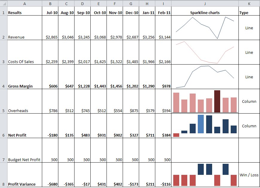
There are three types of Sparkline charts. A line chart, a column chart and a win loss chart. The first two are useful in many situations. However the win loss chart has limited use. When you have the Sparkline charts selected a Design ribbon is displayed which allows you to change the preferences for the chart.
The image below displays examples of all three spark lines. These examples are in the attached file that you can download at the bottom of this post – you will need to Excel 2010 to view the Sparklines.
The Sparkline charts are useful to show trends over time. There are not a lot of options to change for these charts as they are a reasonably basic. There are a number of colour options for the Sparkline charts.
You do need to be careful in accepting the default settings, as sometimes the column charts do not start at zero and hence the scale between the columns may appear incorrect. The Axis options on the Design Ribbon allow you to modify the default axis settings.
Sparkline charts have been available for Excel for many years, but they were only available through third-party Excel add-ins. These add-ins typically contain many types of Sparkline charts and if you are producing dashboards it may be worth investing in one of these third party solutions. A Google search for Sparkline charts in Excel should provide a number of options.
Most of these third-party solutions also work in all Excel versions.
The term Sparkline is credited to Edward Tufte who is a proponent of better data visualisation techniques. He has written a number of good books on data visualisation.
Stephen Few is another author who advocates better charting practices. Check out some examples of bad charting and his proposed solutions here http://www.perceptualedge.com/examples.php
Download Sparklines example file

Please note: I reserve the right to delete comments that are offensive or off-topic.