Dashboard Charts are the ultimate goal of most Power BI reports, so let’s dive in.
In the first post we extracted the raw data from a CSV file.
In the second post we created a simple report.
In this post we will look at the charts or Visualizations as they are called in Power BI. (Excuse the spelling – when referring to an Excel option I will use “z” – US spelling – otherwise I will use “s” the Australian spelling)
I started by creating a new blank page and named it Dash.
Dashboards are seen as the ultimate output report from Power BI, turning raw data into impressive visualisations.
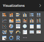
There are many more options than Excel. You can also import custom visualisations – I wonder if eventually there may be people making a living from creating great looking new visualisations?
KIS Principle
I believe in the “Keep It Simple” theory of charts, so let’s start with the good ol’ Clustered column chart.
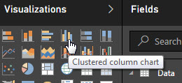
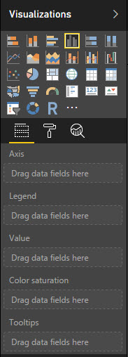
When you click the Clustered column chart icon a default chart appears on the page on the left.
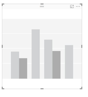 This is ready for you to drag and drop the data fields into the various sections shown underneath the Visualizations pane.
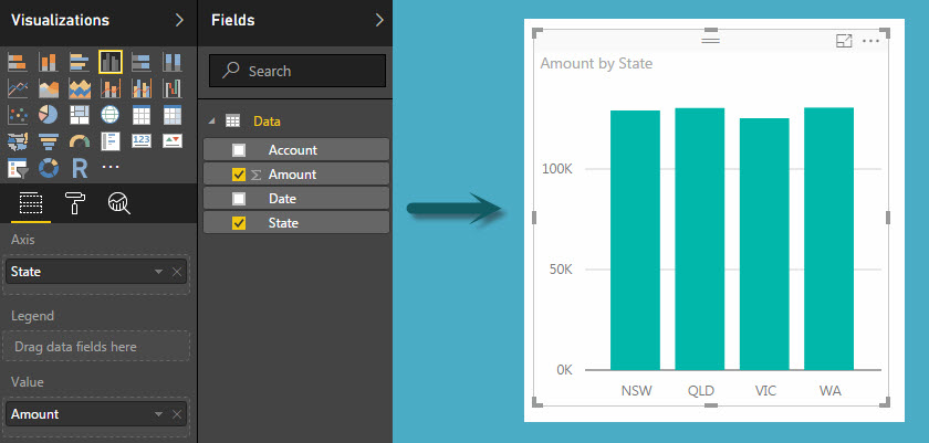
The image below shows the settings used for a basic chart. Notice that it automatically used the K (1000 s) format for the values on the left axis.
There is a Filter section beneath the Chart options.
Because State and Amount have been added they are available to use as Filters. You can also drag other fields to the Visual level filters Section eg Date, I have added Date and filtered it for June 2016.
Note: You must click the Apply Filter at the bottom for it to update the chart.
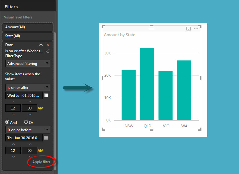
Chart Titles etc
Just like the report we looked at in the last blog post, to add titles and labels you need to click the Paint Roller icon.
 The options will be listed
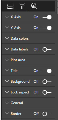
I won’t go into any detail on those. Suffice to say there are lots of options to play around with and they seem reasonably straight forward.
Analytics
You may have noticed a third icon – it is called Analytics.
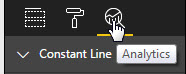
It offers some cool and useful additions to your chart. Most are self-explanatory.
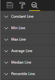 The Constant Line option is a line you can create and define. For example you may want to insert a target line on the chart but there is no Target field/value in the data.
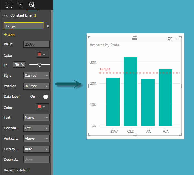
I have added a Target line to the chart – see the settings below with the resulting Chart.
As you can see it is fairly easy to create a simple chart and Filter it in Power BI. There are lots of charts to choose from, I will look through more in future posts.
Don’t be afraid to play yourself – remember you are not affecting the data in anyway.
Please note: I reserve the right to delete comments that are offensive or off-topic.