In the previous post we extracted the data from a CSV file. Now let’s create a report. It won’t be the greatest report as the data is pretty basic, but at least its a start.
In Power BI you have the Fields section – your data table(s) – on the far right of screen.
The blank page on the left is where you build your report / dashboard. It is a free form page, not a grid like Excel.
Between the two sections is the Visualizations section where you select the chart/report/slicer.
You can drag field names to the Values section just like a PivotTable. See example below.
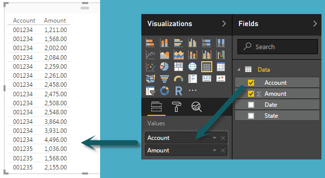
I think this report is called a tile. You can move it around the page wherever you want – there is no grid as such – more like PowerPoint than Excel.
Unlike a PivotTable it doesn’t automatically summarise the data – note the account numbers are repeated in the above image.
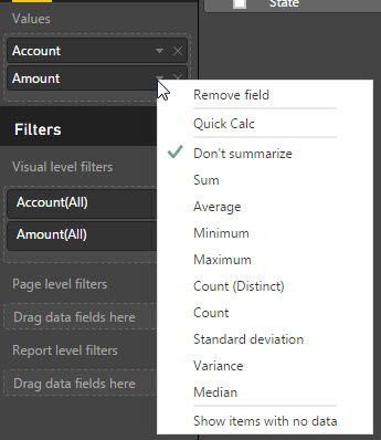
To get a summary report you must change an option. Click the drop down on the right, next to the Amount file in the Values section. If the Don’t summarize option is ticked, you can see the problem.
Simply select the calculation to perform – Sum in this case – and the report updates as below.
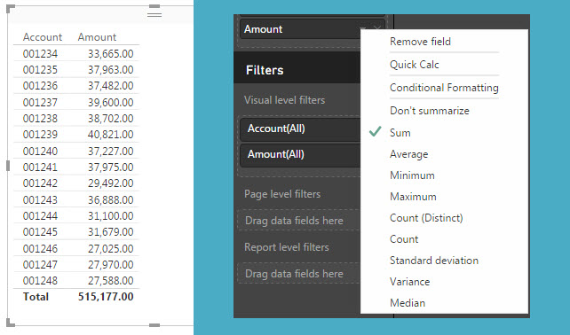
Note: The total of the whole report is shown at the bottom of the tile. You may be seeing all the data but the total will still display. You might need to educate readers that you aren’t always looking at the full list even though the total is showing.
Changing a Query
When I added the State to the position above the Account in the Values section I saw an issue – see the yellow shaded section below.
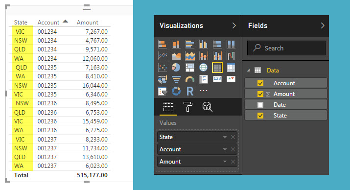
The state entries in the data had leading and trailing spaces. This is a common issue with downloaded data and it is also common to spot problems once you have started working with your data.
In this case its pretty easy to correct. On the Home ribbon click the Edit Queries icon.
This takes you back to the query we create in the previous blog post.
- Select the State column
- Click the Transform ribbon
- Click the Format icon drop down
- Select Trim
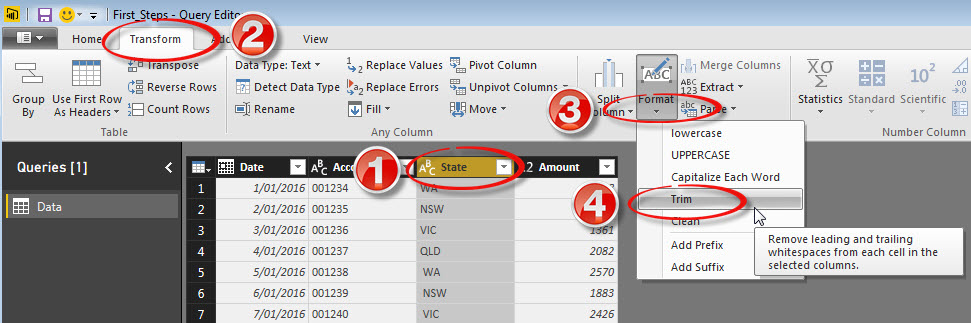
Then go back to the Home ribbon and click the Close and Apply icon (top left).
The Data model is amended and the report updated.
Pages
Bottom left of the screen is Page 1. Right click it and you can rename it or duplicate it.
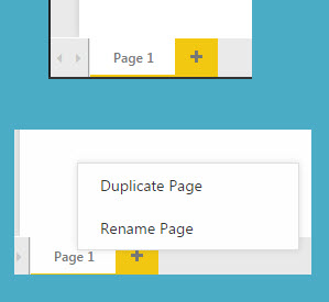
You can also double click it to rename it, just like a tab in Excel. The plus sign allows you to add extra blank pages (tabs).
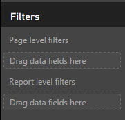
Below the values section is the Filters section and you can see you can add filters to pages or the whole report. Just drag the field to the relevant filter section.
Formatting
There is no title on the report. You can add this in the Format section. Click on the Painter Roller icon (seems we have been upgraded from the Excel’s old Format Painter paint brush to a roller).
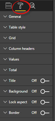
Make sure you have the report selected when you click it.
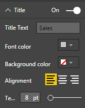
Clicking the Title drop down to see all the options.
Sorting
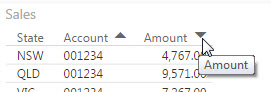
Each of the column headings in the report has a sort arrow. You can click on it to sort in ascending or descending order – see below.
The next post will look at creating a chart.
Please note: I reserve the right to delete comments that are offensive or off-topic.