It is common in accounting to compare numbers. Either Actuals vs Budget or this year vs last year. There are different charts that people use for this comparison. How about plotting the variance instead?
When you are comparing two data sets you typically want to know what happened in the current period and Year To Date (YTD). Let’s do a Current Year (CY) and Last Year (LY) comparison.
Sometimes you chart both measures, but that doesn’t really help you identify problems and how the YTD variance is progressing.
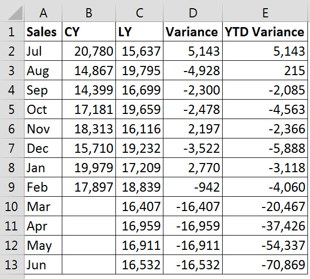
The table below contains the figures I will use for the demonstration. A positive variance means that this year is above last year’s result.
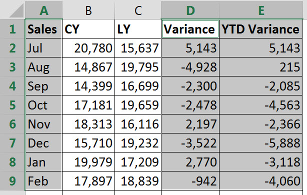
To create the chart I used the Ctrl key to select the two ranges as shown below. Select A1:A9 as normal then hold the Ctrl key down and use the mouse to select D1:E9.
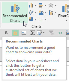
Click the INSERT tab. In Excel 2013 clicking on the Recommended Charts icon will provide a quick solution – see below.

This chart shows the monthly variances as column charts as well as the YTD variance as a line chart. I removed the chart Gridlines on the chart below ( I don’t like gridlines – personal preference).
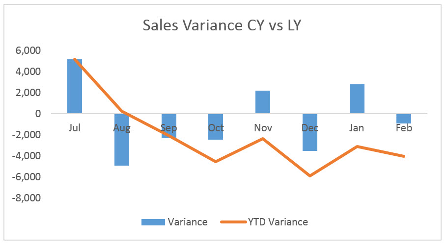
The only time this chart is not useful is when the monthly variance is only one way eg always negative. That causes the vertical axis scale to increase for the YTD line as the year progresses. This causes the column charts to become smaller and less readable as the year progresses.
The above chart allows you to see each month’s variance, whether it is positive (good) or negative (bad), as well as the cumulative YTD variance.
The chart shows that the year started well, but has been running below last year for most of the year.
You can download the above chart at the link below.
Great article!
Thanks Tristan.
Good article but a real accountant actions the numbers and explains the trend. A bookkeeper and marketer with presentation skills can present a nice graph like this. A business wants actionable feedback, not a nice graph. As a 20 year CPA, I’ve learnt from many CPA’s that this may help a non-accountant understand things but that a business expects allot more. Also, Excel spreadsheets are prone to error so set reports from the accounting package is preferable.
Hi Mark
Thanks for your comments. Charts make it easy to spot trends and differences (for accountants and non-accountants) – they are much easier to read than tables of figures.
Most people in the business are non-accountants and so we need to be able to communicate the numbers to them. That’s where charts come in.
Unfortunately most accounting packages have limited presentation features.
The best of both worlds is to import the data direct from the accounting package into Excel and use Excel to analyse the data and turn it into actionable information.
Excellent Reply Note.
I appreciate your efforts Mr. Neale Blackwood.
Great happy learning
You are welcome.