A Column chart walks into a Bar chart … sorry, I couldn’t resist that. Column charts are one of the most popular and straightforward of Excel’s many chart types. Its close cousin is the Bar chart.
Column charts have vertical columns and Bar charts have horizontal bars.
They both can display the same type of data. The Column chart is more popular as it usually reads from left to right, which is how we are used to viewing charts.
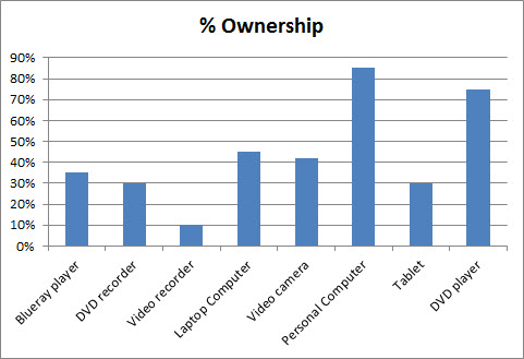
Bar charts are useful if the data labels are long. Long labels are hard to display on Column charts. See example below. (All the percentages are made up).
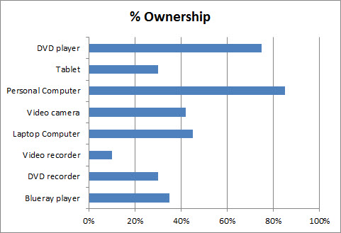
This chart is easily converted to a Bar chart. Right click the chart and select Change Chart Type and choose Bar chart.
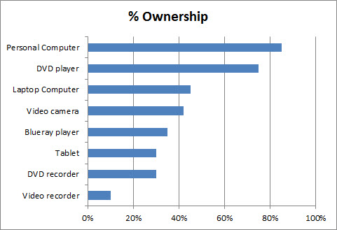
This is easier to read. In this case the order of the entries isn’t really important. So to improve the chart’s readability I would sort the entries from highest to lowest. Making comparisons is easier on sorted values.
There are a few other changes I would make to improve this chart
- remove the chart gridlines (Chart gridlines are usually the first thing I delete – they add unnecessary “noise” to a chart)
- Insert value labels
- Decrease the gap width (this increases the height of the bars)
- Since the labels are displayed I would remove the horizontal axis
- Move the Chart Title to the bottom right and increase the plot area size
This results in “cleaner” chart. Bar chart example
Related Posts


As Excel defaults to column charts, the bar chart is often overlooked which misses out on better presentations as illustrated above.
The other type of chart commonly misued is the pie chart.
Thanks Robert. I agree, the Pie chart has very limited application and is over used.