Just because you can, doesn’t mean you should. This applies to many thing in Excel and especially to charts. With charts the “less is more” philosophy works well. Have a look at the four charts in the image below.
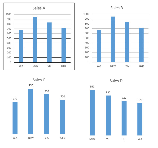
These four charts all have exactly the same data, but they have varying degrees of readability.
Sales A is old school and not really used anymore – thank goodness – it uses black for all its lines and gridlines.
Sales B is more the default Excel chart these days, using grey for the lines and gridlines. It also has fewer lines in general. B is easier to read than A as it has less chart junk.
Sales C removes the vertical axis and adds value labels – less is more – C is easier to read than B.
Sales D is the best chart overall as it takes the advantages of Sales C and sorts the series by value. This makes it is easy to identify the highest and lowest results. You can’t always do this of course. If there is no inherent sequence you can sort the items listed.
It is a big leap from A to D, but it was achieved with small jumps. The Delete key works wonders with charts.
Overall, use lines sparingly on charts. If you do use them, use grey lines, not black lines. You will end up with more white space and less clutter, making the chart easier to read.
Please note: I reserve the right to delete comments that are offensive or off-topic.